
Brand
guidelines
Updated 5 October 2026
This is how SEC looks and sounds: one logo, three colours, one typeface, and a way of writing.
It is here so that a new exec can make a post or a deck that looks like SEC on the first try, and so that a partner can place our logo correctly beside theirs.
Exec turns over every year. These standards are what keep the club recognisable across that handover.
At a glance
Logo
Two versions: black on white, white on black. Clear space of 17% of its height. Never under 16px tall on a screen.
Colour
White, black, and one orange with two states: #FF8033 on white, #FFA770 on black.
Type
Outfit, in four weights. It has no italic, so emphasis is weight or the orange.
Voice
Plain, specific, confident. Say the real thing.
Contents
01Brand strategy
Plenty of students arrive at university with ambition and no obvious way to use it. They have nobody to introduce them, they don't know which door to knock on, and the gap between "I have an idea" and "I built something" stays unbridged for four years.
SEC exists to close that gap.
Founded in 2014 at the Schulich School of Business and open to any undergraduate, SEC runs workshops, case competitions and a conference each year.
The club rests on three pillars: Ideas, Connections, and Action. Every event should deliver at least one of them, and the best ones deliver all three.
Vision and mission
Our vision
To empower aspiring entrepreneurs to innovate, collaborate, and lead with purpose.
Our mission
Our goal is to provide aspiring business leaders in Canada a platform to allow their ideas to blossom, connections to forge, and take action on their plans.
What we promise members
Three things: to learn, to gain real experience, and to belong.
The vision and the mission are the club's own words, from its 2026 partnership package.
Who it's for
Students who are curious about entrepreneurship and want a community of like-minded people. The curious come first; you do not need a company in mind to belong here.
The feel
Grounded and refined
The trust side. A sponsor takes it seriously.
Modern, ahead of its time
The ambition side. A student feels they are joining something that is going somewhere.
Bold
High contrast, and one big thing on each page or slide.
Sharp
Precise and edited. Nothing decorative that is not doing a job.
Would a sponsor's VP and a curious first-year both think "these people have decided things"?
What it must never feel like
A bank
Navy and grey, stock handshakes, safe.
A generic campus club
Template layouts, rainbow gradients, emoji as decoration.
A start-up cliché
"Disrupt", neon on black.
Childish
Too playful for a sponsor to hold.
02Personality
SEC is for students who are curious about entrepreneurship, and the way we talk to them decides whether it feels open or intimidating. The voice in one line: plain, specific, confident. Say the real thing.
Tone and voice
Direct
not corporate
Encouraging
not hype-y
Sharp
not stiff
Inclusive
not cliquey
Sample copy
Join SEC. $20 for the year.
The Join page's headline. The price is in the first line, so nobody has to look for it.
Applications close Mon 12 Oct
The First-Year Rep hiring line. A deadline is a day and a date, never "soon".
Registration not open yet
When something is not ready, the page says so in plain words and does not hide it.
Date to be announced
No date is ever guessed. An event without one says that, and gets its date when the club sets it.
Writing rules
- Lead with the specific thing. The company, the date, the place, the number.
- No claim nobody can check. Not ultimate, top-tier, next level, exclusive. If it is true, say the fact that makes it true.
- Say what happens, not how to feel. "Pitch to a panel of judges", not "high-stakes".
- Every claim carries a number or a name. A claim with neither is an adjective.
- Every call to action carries a date. Never "releasing soon".
- Capitals sparingly. One word or short phrase a piece, on the thing that is big. Never a whole line.
- We and you. SEC speaks as we, to you.
- Sentence case. Headlines included. Only labels are in capitals.
- No emoji as decoration. None in headlines, lists or documents. In a social caption only, one marker a line from a set of four: 📍 📅 🎟 ➜
Names
UEC
The Undergraduate Entrepreneurship Conference. Its two days are Launch Day and Competition Day, never Day 1 and Day 2.
SEC × RCIBA
Two clubs on one line take a true multiplication sign with a space each side. Never an x, never a slash.
Program
Not programme. One spelling in everything SEC publishes.
03Logo
The SEC logo is a heavy italic wordmark (the three letters, drawn as one image) with a small gradient triangle tucked into the notch of the E, pointing right. The triangle is the only colour in it.
Primary lockup

The files
Swipe sideways to see the whole table.
| File | Use | Background | |
|---|---|---|---|
| Wordmark, black sec-wordmark-black.png | Everything on a white background: documents, the website, light posts. | White or near-white only |
| Wordmark, white sec-wordmark-white.png | Everything on a black background: dark posts, photographs under a dark layer. | Black or near-black only |
 | Profile disc, white background sec-avatar-black-on-white.png | Profile pictures and circular crops. | Carries its own background |
 | Profile disc, black background sec-avatar-white-on-black.png | The same, where the platform is dark. | Carries its own background |
Anatomy

The triangle runs from yellow at its upper left to coral at its tip. It is always a gradient: there is no flat version. It is a quarter of the wordmark's height, which is why the logo cannot go very small.
It is not the brand orange, and neither is changed to match the other. The logo exists as image files only, about 4,700 pixels wide: enough to print about 40cm (15 inches) across. Anything larger waits for a vector version.
Clear space
Leave clear space on every side equal to the height of the E's middle stroke, about 17% of the wordmark's height, at minimum. Nothing (type, image edge, or button) enters that margin. When in doubt, give it more.
xxSize
Never under 16px tall on a screen. Use 16 to 24px in small places such as a site header or a footer, 24px and up ordinarily, and 40px and up where the logo is the main thing: a cover, a title slide, a poster. In print, 12mm tall at the smallest.
16px tall
The smallest
24px tall
Ordinary use, and up
40px tall
The triangle reads as a gradient
Backgrounds
On white
On black
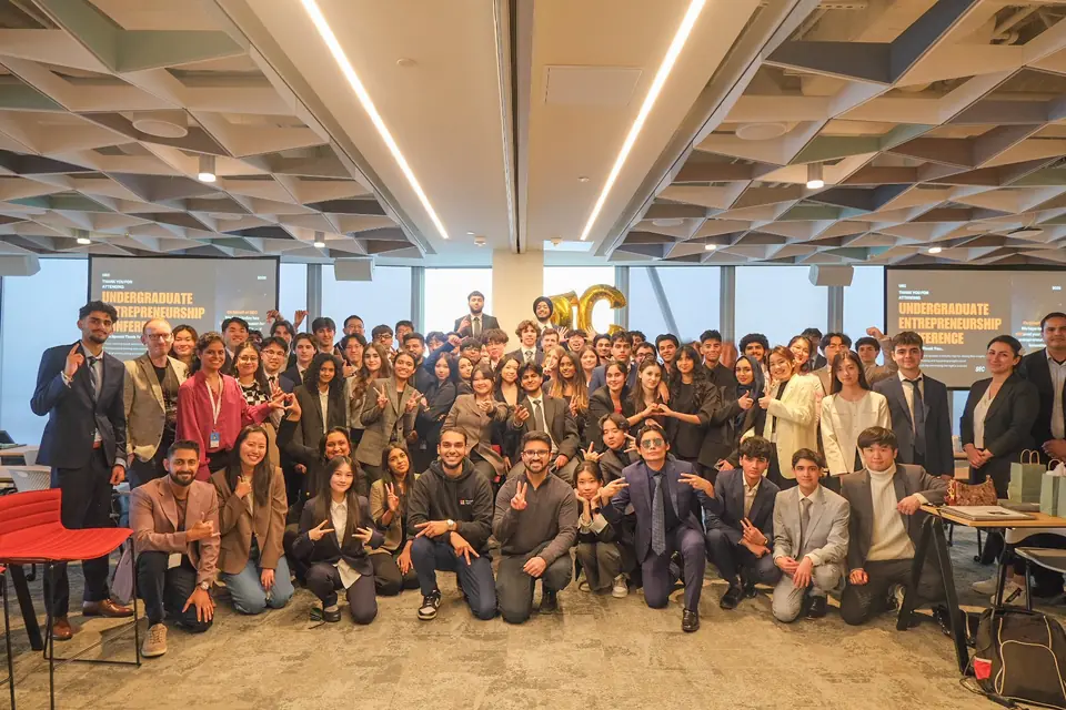
On a photograph, under a black layer at 62% opacity
Not on a grey or a colour
Incorrect usage
Don't recolour the letters
Don't stretch or distort it
Don't rotate it
Don't add a shadow, outline or glow

Don't place it on a bare photograph or a mid-grey
Don't set it under 16px tall
Don't remove or flatten the triangle
Don't rebuild it in Outfit
Our next eventDon't use the profile disc inside a layout
04Colour
White and black carry roughly 90% of any screen. Orange is the single accent: about 10% of a view, never a repeating decoration. It has two states, one for white and one for black, and the two never appear together.
On white · the default
On white, orange is a fill or a headline
Fills, lines and headline words, with ink on any orange fill. Never small text: labels, links, captions and running text stay ink or grey.
On black · used sparingly
On black, orange is the voice
Headlines, numbers, labels and lines. Running text stays light grey. Black is for covers, announcements and the pages that matter most.
Primary palette
Orange · light, on white only
RGB 255, 128, 51
Orange · dark, on black only
RGB 255, 167, 112
Black
RGB 0, 0, 0
White
RGB 255, 255, 255
White and black, about 90%. Orange, about 10%. Press a value to copy it.
Secondary palette
Greys for text, lines and panels, worked out from black and white. Black is the background; Ink is the text on white. The peach tint is the one soft panel allowed on white.
Ink
RGB 17, 17, 17
Body
RGB 58, 58, 58
Muted
RGB 107, 107, 107
Rule
RGB 228, 228, 228
Panel
RGB 245, 245, 245
Peach tint
RGB 255, 240, 230
Body · dark
RGB 230, 230, 230
Muted · dark
RGB 154, 154, 154
Rule · dark
RGB 42, 42, 42
Panel · dark
RGB 20, 20, 20
Gradient palette
Yellow to orange to coral. Reserved for the logo's triangle and used nowhere else. The three values were read off the logo file and are approximate.
The triangle's gradient
#FCE83E → #F69E2C → #F2634A
Yellow
RGB 252, 232, 62
Orange
RGB 246, 158, 44
Coral
RGB 242, 99, 74
Contrast
Check every new pairing of text and background before using it; WebAIM's contrast checker is free. The accessibility standard (WCAG, level AA) asks for 4.5:1 for normal text and 3:1 for large text. AAA is its stricter level, 7:1. The ratios below were worked out with the standard's formula.
Swipe sideways to see the whole table.
| Pairing | Sample | Ratio | Grade | Use |
|---|---|---|---|---|
| Ink on White | Sample | 18.9:1 | AAA | All headings and strong text on white |
| Body on White | Sample | 11.4:1 | AAA | Running text on white |
| Muted on White | Sample | 5.3:1 | AA | Labels and captions. Nothing lighter than this |
| Ink on Orange · light | Sample | 7.5:1 | AAA | Text on an orange fill |
| Ink on Peach tint | Sample | 17.0:1 | AAA | Text on the soft panel |
| Orange · dark on Black | Sample | 11.0:1 | AAA | Headlines, numbers and labels on black |
| Body · dark on Black | Sample | 16.8:1 | AAA | Running text on black |
| Muted · dark on Black | Sample | 7.5:1 | AAA | Labels on black |
| Muted on Black | Sample | 3.9:1 | Fails | Never. Use Muted · dark on black |
| Orange · light on White | Sample | 2.5:1 | Fails | Headline-size words only, never small text |
| Orange · dark on White | Sample | 1.9:1 | Fails | Never. This orange does not go on white |
| White on Orange · light | Sample | 2.5:1 | Fails | Never. Text on an orange fill is ink |
Rules
- One orange, two states. #FF8033 lives on white, #FFA770 lives on black. The greys and the peach tint are worked out from black and white, not chosen.
- No gradients except the logo's triangle.
- White is the default; black is used sparingly. If everything is black, nothing stands out.
- On white, orange is never small text. Fills and headline words only.
- On black, orange is never running text. Headlines, numbers, labels, lines.
- No grey or coloured backgrounds. A layout is white or black. Grey is for lines and quiet text.
05Typography
Outfit, in four weights: Regular (400) for running text, Medium (500) for display, SemiBold (600) for headings, labels and numbers, and Bold (700) for the one highlighted word in a headline. Headlines and running text stay sentence case. Capitals are for labels.
Outfit is free on Google Fonts, so print, social and the web use the identical typeface.
Sizing
Display
Ideas start here
64 to 108px · Medium 500
Heading
Ideas start here
28 to 46px · SemiBold 600
The one word
Ideas start here
one word a headline · Bold 700
Body
Ideas start here
16px, line height 1.55 · Regular 400
Label
Ideas start here
11 to 12px · SemiBold 600 · capitals, spaced wide
Number
2014
40 to 72px · SemiBold 600 · figures of equal width
Sizes are in pixels for a screen or a 1920px-wide slide; a 1080px-wide post is set larger (see Applications). A line of running text is 68 characters at most. Nothing is set thinner than 400, and Outfit has no italic.
The scale
Eleven sizes. Nobody invents a twelfth. Lines sit closer as type grows: a line height of 1.55 for running text, 1.25 for headings, 1.0 for display.
11
12
14
16
20
28
36
46
64
84
108
Weights
400 · Regular
Running text
500 · Medium
Display
600 · SemiBold
Headings, labels, numbers
700 · Bold
The one highlighted word
The lighter weights (100 to 300) and the heavier ones (800 and 900) are never used.
Rules
- Outfit only. No second typeface. The logo is the one exception, and it is an image, not type.
- One display line a layout. If two things want to be the biggest, one of them is wrong.
- Labels are set in capitals, spaced wide. Headlines are sentence case, always. The only other capitals are the one capped word a piece that the writing rules allow.
- No fake italics, no underlines for emphasis. Emphasis is weight or the orange.
- Figures of equal width wherever numbers line up in columns.
06Elements
Five things repeat across everything SEC makes, and nothing else does. Each one carries information: a reader who recognises SEC without seeing the logo is recognising one of them.
The five
UEC 2026 · Launch Day
The bar
A short orange rule before every label. It always comes before a label and never stands alone.
Two days, one case.
The one word
One word a headline at weight 700: ink on an orange fill on white, orange text on black. Never two, and never in running text.
The evidence row
Three numbers with labels in a ruled row. Only where the numbers are real and are the point.
The switch to black
A black block on a white page, or a white page after black. Once a document or a section: if every page switches, none stands out.
Schulich Entrepreneurship Club12
The foot line
A label on the left and a number on the right, at the bottom of every page and slide of anything longer than one.
Spacing
Ten gaps, in pixels, and nothing in between. When a layout feels empty, it is probably right.
4
8
12
16
24
32
48
64
96
128
| Gap | Used for |
|---|---|
| 4 to 8px | Inside a label; between a bar and its text; a number and its caption |
| 12 to 16px | Between related lines; a heading and its paragraph; items in a list |
| 24 to 32px | Between related blocks; cards in a grid; a paragraph and the next heading |
| 48 to 64px | Between sections on a page |
| 96 to 128px | Between major sections; the margin of a slide |
07Art direction
Every photograph SEC uses is from a real SEC event. The photographs are the evidence: they show what turning up looks like.
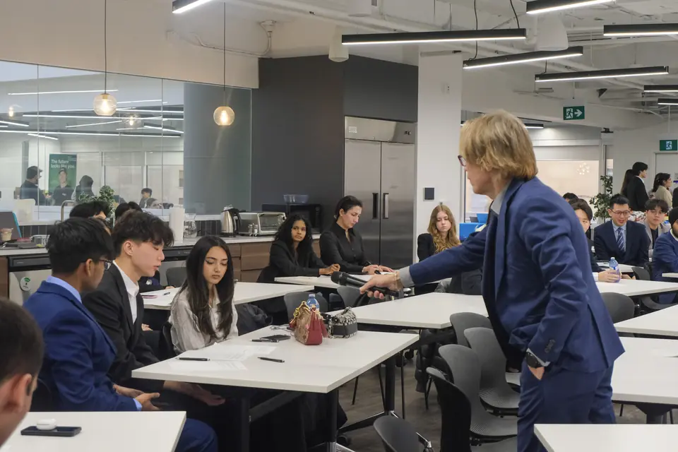
UEC 2025 · 13 March 2025
Real rooms, real people
Every photograph is from a real SEC event. No stock, no staging, and no reuse of one event's photo to illustrate a different one.
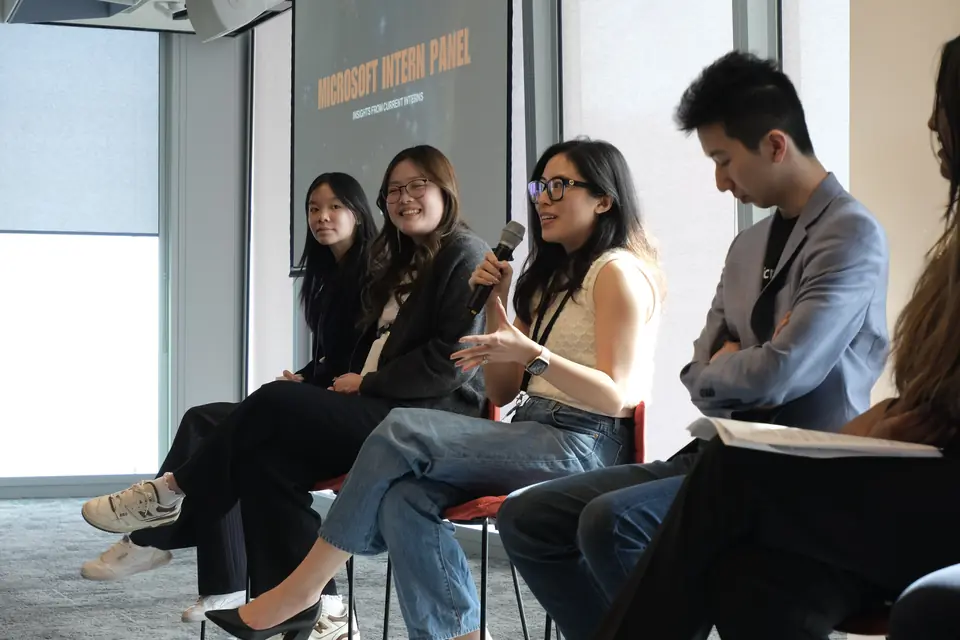
UEC 2025 · 14 March 2025
Honest captions
Caption what the photo actually shows: the event and the date. If a caption can't be written honestly, the photo doesn't go in.
LUMEN 2026 · 21 March 2026
People over venues
Favour rooms with people in them over empty halls and branding.

Infinite Case Competition · 14 November 2025
Working shots over posed
Heads-down, mid-conversation, mid-build. The point is to show what attending actually looks like, not a staged version of it.
Two treatments
UEC 2025
About 120 students, two days.
On white: beside the words
The photograph is natural, in colour, with no filter, tint or overlay. The words sit beside it, never on it.
UEC 2025
About 120 students, two days.
On black: under a dark layer
A black layer at 62% opacity goes over the photograph, and the words sit on it. Enough that white text reads, little enough that the colour still shows.
Rules
- Never words on a bare photograph, on white or on black.
- No black and white, no two-colour effects, no orange tint. Orange lives in type and fills, not in the image.
- Real over stock, always. A layout with no real photograph uses none: it uses type and the orange.
- Prefer frames that prove something: a full room, a judge listening, a team presenting.
08Partners
When SEC shares a page with another club, the two carry equal weight, and the club that made the piece leads on the left. Sponsors never join that line: they sit in a row of their own.
Placing our logo beside yours
If you are a partner or a sponsor: take the black wordmark for a light background or the white one for a dark background, from the download kit. Keep the clear space, keep it 16px tall or more, and do not alter it. If you need another format, or are not sure a use fits, write to us before it goes out.
×PARTNER×PARTNER"PARTNER" stands in for another club's logo. One with no white version sits in a white box on black: the only white fill allowed there.
Two clubs, one line
Order
Equal visual weight. The club that produced the piece goes first, on the left.
Size
The letters match: both names read at the same height, on one baseline.
Between them
A multiplication sign in Outfit 400, in grey, or a 1px line as tall as the wordmark. 24px either side on a web page (a quarter inch on a printed page), 48px on a 1920px-wide slide.
Clear space
The logo's rule applies to the pair: 17% of the wordmark's height around the whole line.
Never
Recolour a partner's logo, shrink one club, or stack the two unless the width forces it.
Sponsors
Sponsors sit in their own row, under a 1px line and a Partners label: equal height, in their own colours, 32px apart, no more than six to a row. Their logos are not turned grey.
Partners
York and Schulich
York University's brand rules say that clubs and student-run initiatives "are not permitted to use any element of the York brand (such as the fonts, colours, logos or design system)" unless the university approves it. Ask before placing the York or the Schulich logo on anything SEC makes.
York's logo rules, read 5 October 2026. York gives cpabrandmar@yorku.ca for requests.
09Applications
Every surface inherits the kit unchanged. A surface may narrow the rules; it may never add a colour, a typeface, a repeating element or a shadow. Black is for the cover, the title, the divider, the opening and the announcement. Content is light.
Swipe sideways to see the whole table.
| Surface | Size | Background | What is different here |
|---|---|---|---|
| Slide deck | 1920 × 1080px, 96px margins | Light slides; black title slide and section dividers | One idea a slide. A headline of 16 words at most. The big line is 84px on a title slide; other slides stop at 46px. |
| Document or PDF | Letter, 0.75 inch margins | Black cover, light inside | A label at the top and a foot line with the page number. 68 characters a line at most. |
| Website | Any width | Light; a black opening is allowed | Sections open with a label. Outfit from Google Fonts. |
| Post 1080 × 1350px · Story 1080 × 1920px | Light; the first slide of a carousel is black | One big line of 7 words at most, set at 96px with 96px margins. Words on a photograph only under the 62% black layer. On a story, keep the top and bottom 250px clear. | |
| Post 1080 × 1080px · Link image 1200 × 627px | Light | A little more formal. LinkedIn shows about three lines before "see more", so the first line has to make sense alone. |
Examples
Four layouts drawn to scale, to copy. The words on them are true of SEC today; swap in your own.
UEC 2026
Two days, eight days apart.
Schulich Entrepreneurship Club01
A title slide
1920 × 1080px. Black. A label, one big line at 84px with its one orange word, and the foot line.
The club
A student-run club at Schulich, since 2014.
Schulich Entrepreneurship Club02
A content slide
White. A label, a heading at 46px, the evidence row, the foot line. Nothing else.
UEC 2026
UEC 2026. This November.
SEC × RCIBA1/5
The first slide of an Instagram carousel
1080 × 1350px. Black. One line of 7 words at most at 96px, and the slide number in the foot line.
UEC 2025
About 120 students took part.
SEC × RCIBA2/5
A later slide, with a photograph
White. The photograph sits above the words, never under them, and is from the event the slide is about.
10Do and don't
Each pair is a mistake someone will actually make, beside the version that follows the kit. If a layout matches a left-hand card, it is done. If it matches a right-hand card, it is not.
Do
A REAL case.
One word in capitals, on the thing that is big. Used once a piece.
Don't
Get ready for the biggest event of the year!
A whole line in capitals, and a claim nobody can check.
Do
Applications close Mon 12 Oct
Orange on white is a fill with ink on it. 7.5:1.
Don't
Applications close Mon 12 Oct
Orange text on white at this size: 2.5:1, too faint to read. Orange is for fills and headline-size words.
Do
UEC 2025 · 14 March 2025
On white, the photograph sits beside the words.
Don't
UEC 2025 · 14 March 2025
Words on a bare photograph. The rule that gets broken first.
Do
UEC 2025 · 14 March 2025
On black, under a black layer at 62% opacity, the words can sit on the photograph.
Don't
Black and white. The photographs are the evidence, and their colour is part of it.
Do
Running text stays at weight 400: readable on a phone in daylight and on any printer.
Outfit 400.
Don't
Running text at weight 300 looks refined on a designer's screen and disappears everywhere else.
Outfit 300. Never used.
Do
The supplied file, clear space around it, the triangle intact.
Don't
SECStretched, and rebuilt in Outfit. The logo's letters are not the brand's typeface.
Do
In a social caption, one emoji marker a line, from the set of four: 📍 📅 🎟 ➜
Don't
Emoji stacked and at both ends, and a call to action with no date.
Do
×PARTNERLetters the same height, on one baseline, the club that made the piece first.
Don't
xPARTNERThe partner shrunk, off the baseline, and an x where the × belongs.
Download kit
The logo files currently available. All are PNG with transparent backgrounds. The wordmarks are about 4,700 pixels wide; the profile discs are 1,400.
- All four logo files (ZIP) 2.4 MB
- SEC wordmark, black (PNG) 933 KB
- SEC wordmark, white (PNG) 1.2 MB
- Profile disc, white background (PNG) 144 KB
- Profile disc, black background (PNG) 156 KB




The typeface: Outfit, on Google Fonts.
There is no vector version yet. Need a format that isn't here, or not sure a use fits these guidelines? Get in touch.